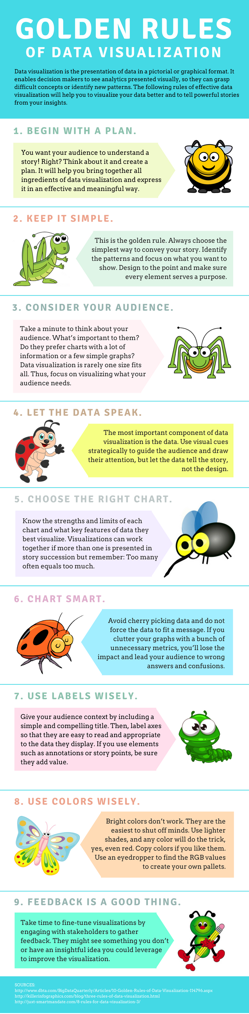

Data visualization is the presentation of data in a pictorial or graphical format. It enables decision makers to see analytics presented visually, so they can grasp difficult concepts or identify new patterns. This infographic explains the nine golden rules of data visualization and will help you to visualize your data better and to tell powerful stories from your insights.